BOOKME.COM
Optimising the hotel discovery and booking experience for travellers.
Designing the search and booking flow to reduce cognitive load and speed up the journey from discovery to confirmation.
UX Designer
1 months
Hotel Booking
Problem
Users struggled to search and book hotels confidently. Search behaviour felt unintuitive, with critical information like amenities and pricing clarity often appearing too late in the journey. This created friction during the selection stage, leading to increased hesitation and abandonment.
Objectives
• Reduce friction in destination search and date selection.
• Enhance visibility of essential booking information early on.
• Improve comparison flows to help users decide faster.
• Simplify navigation to create a predictable and trustworthy journey.
Solutions
1.Designed the search experience to simplify destination entry and date selection.
2.High-impact filters that are visible and easy to apply.
3.Prioritised decision-critical information earlier in the flow.
4.Strengthened visual hierarchy for faster scanning.
5.Transparent booking summary to enabled confident checkout.
Discovery
I grounded the design process in real user behaviour rather than assumptions. By combining competitive benchmarking with observational note-taking, I built a comprehensive map of user expectations, friction points, and the emotional triggers that lead to drop-offs at checkout.
Competitive Benchmarking
I analysed leading platforms like Booking.com, Airbnb, and Agoda to understand industry standards. My focus was on identifying where these 'giants' succeeded and where they created unnecessary noise.
Key focus areas:
Destination search and entry patterns.
Clarity in hotel comparison layouts.
Trust signals in the booking confirmation flow.
Cognitive load management in search results.
Key Findings
Even feature-rich platforms struggled with balance. I found that overloaded interfaces often increased friction rather than utility. Common pain points included:
Cluttered filtering systems that overwhelmed users.
Weak feedback loops when search parameters changed.
Inconsistent information hierarchy making price comparison difficult.
This stage helped me define the design conventions users already expect, allowing me to innovate without adding unnecessary novelty.
Observational Note-Taking
To go beyond the surface, I observed travellers booking stays in real-time. My goal wasn't just to see 'what' they clicked, but to understand the hesitation and decision logic behind each action. I documented:
Mental models of how users search for value.
Moments of confusion during date selection.
• Emotional reactions to hidden costs or complex UI.
Key Findings
Several friction points repeated across sessions:
• Search bars felt unintuitive and difficult to edit
• Users wanted essential booking information upfront
• Visual content strongly influenced decisions
• Amenities were hard to locate or incomplete
• Date changes caused disproportionate frustration
This revealed that the issue wasn’t just finding hotels, it was navigating uncertainty.
Usability Testing
I conducted structured usability tests to observe how real users navigated the booking flow. By giving them realistic scenarios, I was able to capture their natural reasoning, identifying exactly where they felt confident and where they hit a wall.
Research Goals:
Understand key decision drivers during hotel selection.
Identify specific friction points in navigation and date entry.
Observe comparison patterns to see how users evaluate value.
Capture mental models surrounding booking confidence and trust.

Key Findings
The participant immediately used the search bar as the entry point, ignoring surrounding content. This confirmed that search is the psychological starting line of the journey.
Search bar friction: Users found the entry points unintuitive, often struggling to edit details mid-flow.
Information gap: Essential booking details were too hard to find, causing users to hesitate before committing.
Visual noise: Strong visual elements often distracted from critical decision-making data like pricing and amenities.
Date frustration: Unclear date selection patterns caused disproportionate frustration, often leading to search abandonment.
Affinity Diagram
I started by reviewing every meaningful observation from the Benchmarking, Note-taking, and Usability Testing phases. Using Miro, I organised these individual insights into logical clusters to reveal patterns in user behaviour.

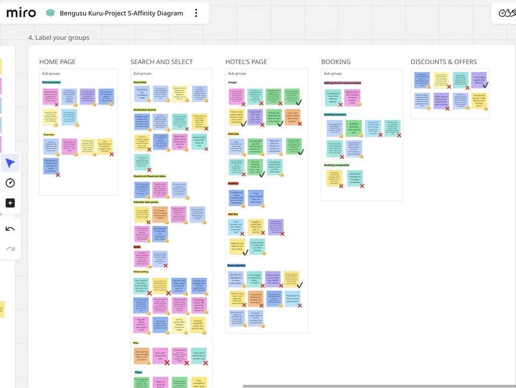
Key Findings
While user feedback covered various pain points, three critical themes emerged as the foundation for my design strategy:
Navigation Clarity: Users needed a more predictable path from the homepage to search results to avoid feeling 'lost'.
Decision-Critical Filters: Essential filters needed to be more accessible to reduce search fatigue and speed up selection.
Booking Confidence: Transparent summaries and clear 'next steps' were required to reassure users before the final payment stage.

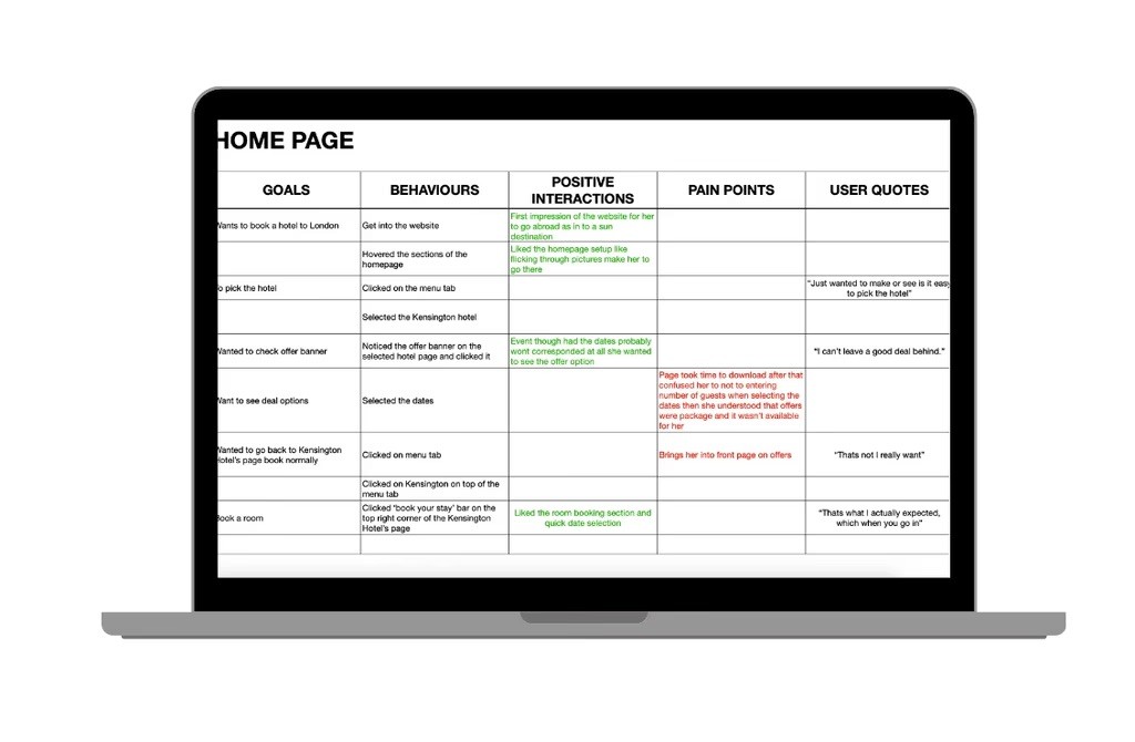
Customer Journey Mapping
Using insights from the affinity diagram, I created a customer journey map to visualise each step of the booking process. It highlighted user goals, pain points, and positive moments helping me identify where the experience could be improved and guiding key design decisions.
My customer journey map captures each step of the hotel booking experience from initial search to booking confirmation through the lens of real user behaviour. It includes user goals, behaviours, mental models, pain points, and customer feeling, structured into a clear and cohesive flow.
This structured artefact helped me translate raw research into a visual, story driven map that guided my design decisions and kept the user’s voice central throughout the process.

Results
To translate research into a practical solution, I followed a structured design process focused on clarity, iteration, and user intent. The goal was not just to design screens, but to design a coherent journey that reduces friction and supports confident decision-making.
Flow Diagram
I began by mapping the end-to-end booking journey, from homepage entry to final confirmation. Creating a flow diagram allowed me to visualise every step users would take, identify required screens, and validate navigation logic before moving into interface design.
This early structure ensured the experience felt predictable, efficient, and free of unnecessary detours.

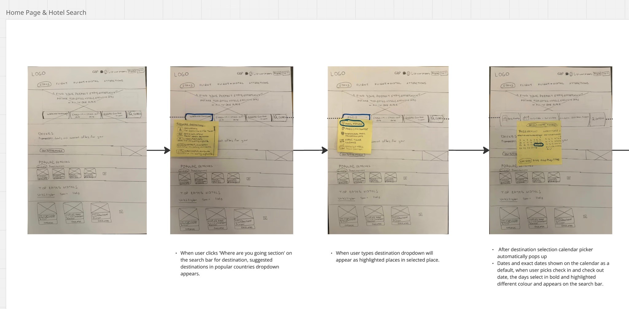
Interaction Design
With the flow defined, I explored screen behaviour through hand-drawn sketches. These low-fidelity explorations focused on layout hierarchy, interaction patterns, and realistic UI components such as calendars, dropdowns, and filtering systems.
Sketching multiple variations allowed rapid iteration and helped surface stronger design directions before committing to digital execution.
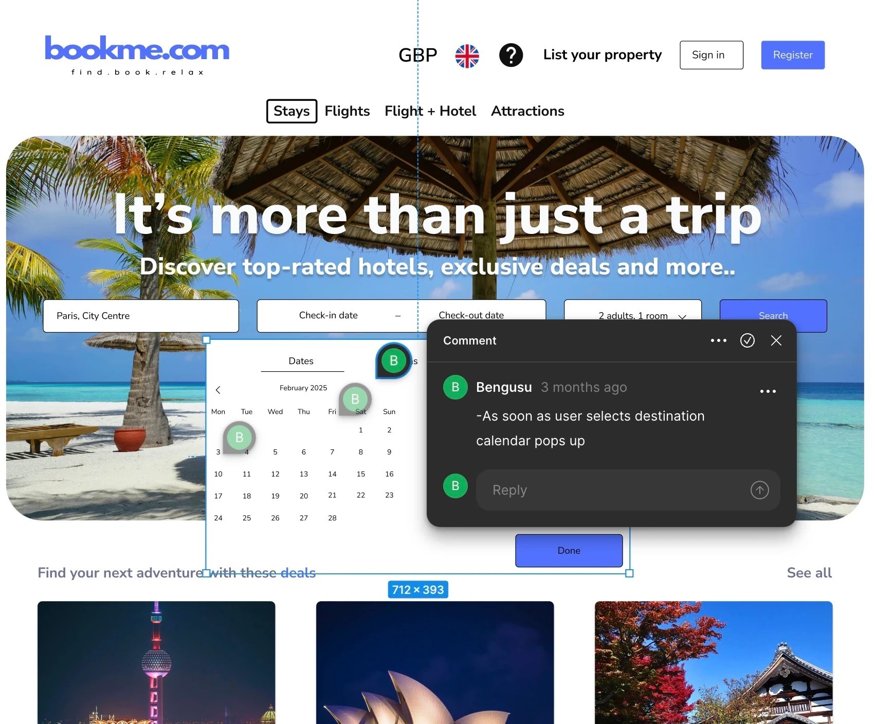
Prototyping
After finalising the interaction concepts, I translated the designs into a high-fidelity Figma prototype. Each screen was built with real content, consistent visual language, and clickable interactions to simulate a realistic booking experience.
This step transformed abstract ideas into a tangible system ready for walkthrough testing and evaluation.
Key Interface Decisions
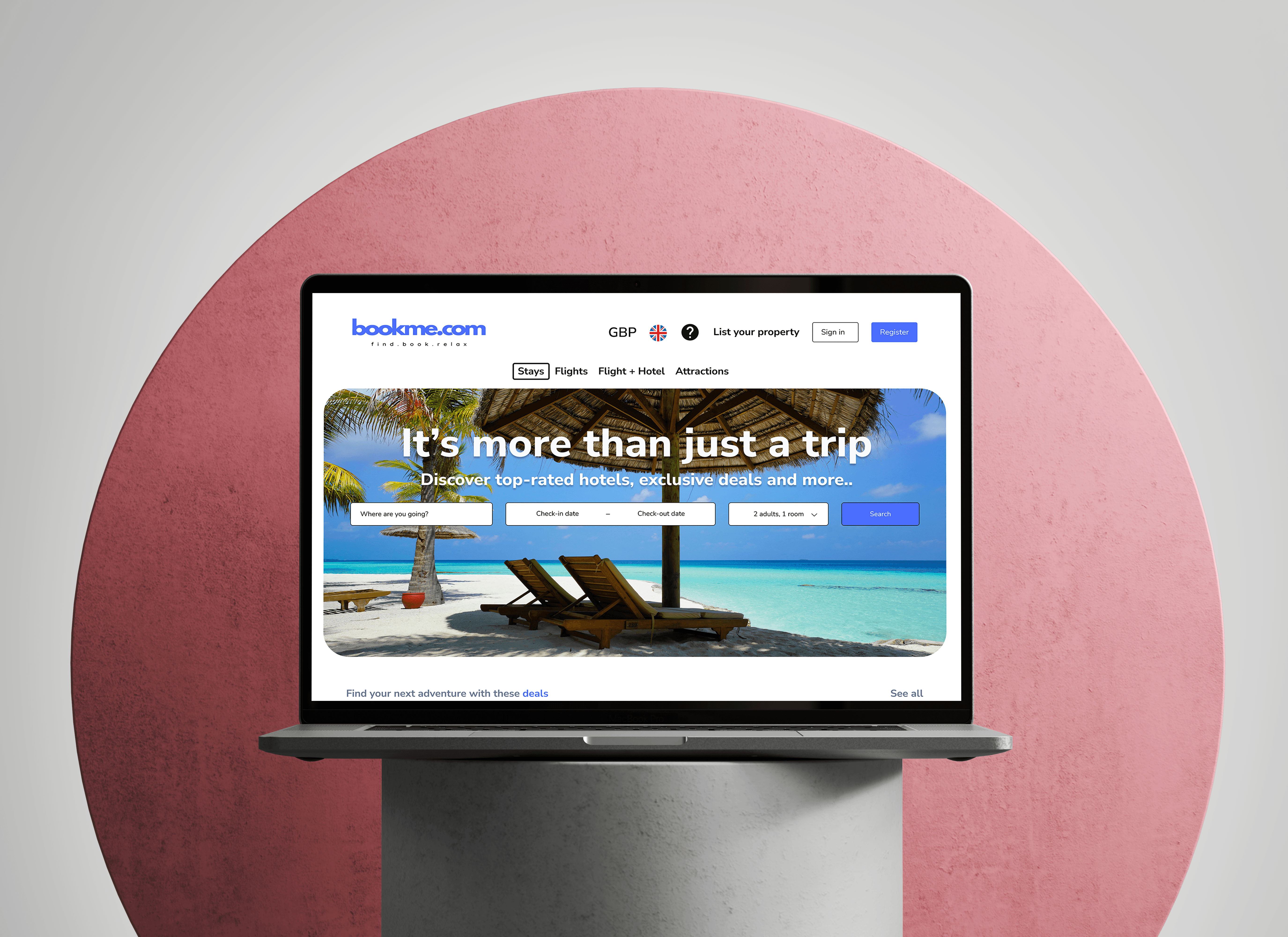
Homepage
The homepage was designed around one dominant user intention: searching immediately.
• Minimal navigation to reduce cognitive load
• Clean visual hierarchy supported by travel imagery
• Subtle promotional content placed below the search area
• Strong, visible call-to-action buttons
The interface prioritises action over distraction, guiding users directly into the booking flow.
Hotel Listing & Selection
The listing page supports fast comparison and confident browsing.
• Persistent, visible filters (Free Cancellation, Breakfast, Pay Later)
• Sorting controls for price and rating
• Structured hotel cards with key details at a glance
The layout reduces scanning effort while preserving depth for users who want more information.
Booking Confirmation
The booking step was designed to maximise trust.
• Clear summary of hotel, dates, guests, and pricing
• Progress indicator to reassure users
• Currency transparency
• Minimal visual noise
The interface focuses attention on completion without pressure or confusion.
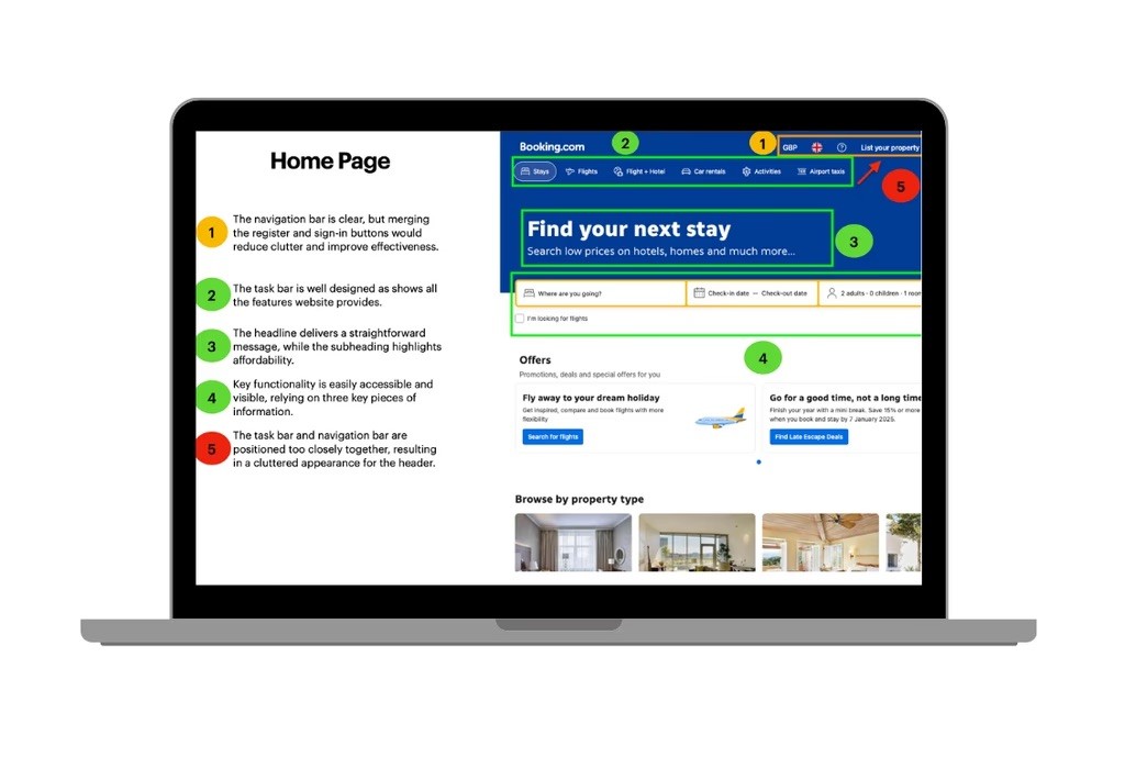
Annotations
To clearly communicate how each screen works, I added annotations to my prototype. These explain the logic behind key interactions, layout choices, and content placement.
Annotations ensured that anyone reviewing the prototype could understand the intent behind each design choice, making the experience easy to interpret and ready for handoff or testing.
Reflections
Working through a full end-to-end process taught me the value of structure. Research grounded my assumptions, analysis clarified priorities, and iteration strengthened every design decision. I began to see interfaces not as screens, but as systems that influence behaviour and trust.
If I continued this project, I would integrate usability testing at more stages of the design cycle and prioritise accessibility from the beginning. Designing for inclusivity isn’t an afterthought, it’s a responsibility.